← BACK TO WORK
CASE STUDY 04 — UX RESEARCH · CONTENT STRATEGY

NGAP.

Redesigning a nonprofit's website to make it easier to donate, easier to volunteer, easier to fall in love with greyhounds.

Client
National Greyhound Adoption Program
Role
UX Designer & Researcher
Team
4 designers
Timeline
12 weeks
01 / THE PROBLEM A NONPROFIT WITH A STORY NOBODY HEARD

Good cause, bad website.

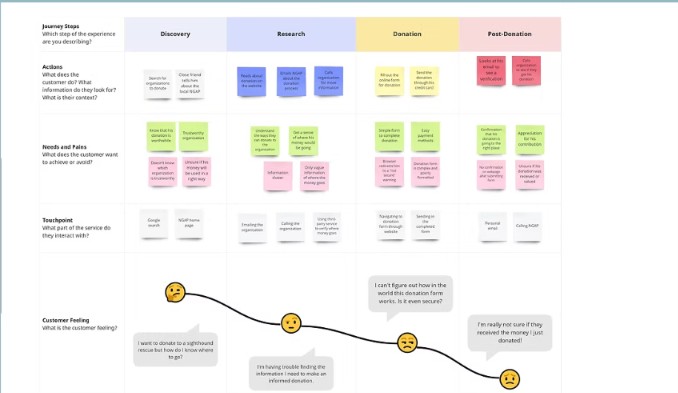
NGAP rescues retired racing greyhounds. The work is meaningful and the dogs are wonderful — but the website was cluttered, confused, and buried the things that mattered most. Tree-testing with three users on three core tasks (donate, volunteer, find contact info) revealed where every breakdown happened. Information clutter and poor navigation were costing the organization donors.

Audit of NGAP's existing website
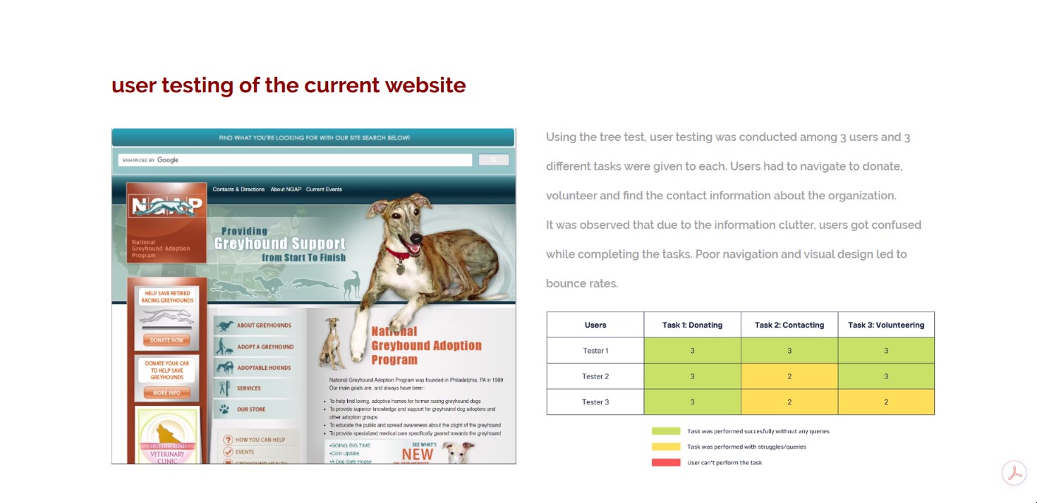
NGAP/CURRENT-AUDIT.JPG
Tree test results from usability researchNGAP/TREE-TEST.JPG
02 / WHO IT'S FOR THREE USERS, THREE PATHS

Adopters, donors, volunteers.

Built three personas around the people who actually show up — Adopter Addison looking for a dog, Donator Dan wanting to give without friction, and Volunteer Valerie trying to find ways to help. Each persona surfaced different content needs that the old IA had collapsed into one undifferentiated stream.

Persona — Adopter AddisonNGAP/ADDISON.JPG
Persona — Donator DanNGAP/DAN.JPG
Persona — Volunteer ValerieNGAP/VALERIE.JPG
03 / WHAT WE DID AUDIT · CARD SORT · REBUILD

Rebuilt around what people came for.

Did a full content audit. Ran open and closed card sorts with 12 users to redesign the IA. Established a new style guide. Built a homepage that puts the dogs and the donation flow front-and-center, not buried five clicks deep.

Then — and this is the part I loved — we built an immersive interactive experience with a character named Scooby who walks users through different paths. Choose your own adventure for a nonprofit. Made the website feel like the dogs it represents: warm, specific, hard to ignore.

Content audit Card sorting IA redesign Style guide Interactive prototype
Redesigned NGAP homepageNGAP/HOMEPAGE-REDESIGN.JPG
New donation flow screensNGAP/DONATION-FLOW.JPG
Scooby — interactive choose-your-own-adventure experienceNGAP/SCOOBY.JPG
04 / WHY IT MATTERED REFLECTION

Nonprofits don't usually get good design. Their websites are afterthoughts built by volunteers, and the work suffers — fewer donations, fewer adoptions, fewer dogs going home. NGAP taught me that design for nonprofits is design for outcomes a real animal feels. That changes how you make decisions.

Good causes don't have to look like bad websites. A redesign isn't decoration — it's how many dogs get adopted next year.
— GET IN TOUCH
I bring the same care to small nonprofit work as I do to building healthcare systems.
jeshah1998@gmail.com → See all work →